
Kadence – Customizing the Header (A Complete Guide)
In this article:
- About the Header Builder
- Available Header Items
- Adding, Moving, and Removing Items
- Editing Individual Items
- Row Settings
- Overall Header Settings
- Mobile & Tablet Header
- Sticky & Transparent Headers

Your header is the area that sits at the very top of your website, usually on every page. It's typically where you'll find your logo, your main navigation menu(s), and sometimes extras like a search icon or social icons.
Let's get started!
To begin customizing and editing your header, go to Appearance > Customize > Header. This will open the header builder.
About the Header Builder
Your header is built using three Rows: Top, Main, and Bottom and each row is split into three sections: Left, Center, and Right. You can drag and drop different header items into these areas (like your logo or navigation menu).

Available Header Items

A quick rundown of what each item does:
- Logo — displays your site's logo (or site title, if you don't have a logo image set)
- Primary Navigation — your main site menu
- Secondary Navigation — a second menu
- Search — adds a search icon/bar visitors can use to search your site
- Button — adds a customizable button (great for a CTA)
- Social — displays your social media icons
- HTML — lets you add custom HTML/text content
- Cart — adds a shopping cart icon (*if WooCommerce is installed)
Your theme's demo content already comes with several of these items placed for you. For example, your logo might already be sitting in the left section of the main row, or your search button might already be in the right section of the top row. If an item isn't showing up in the "Available Items" list, it's because it's already been added somewhere in your header.
💡 Learn more about:
Adding, Moving & Removing Items

- To add an item: drag it from the Available Items list on the left into the row/section you want, or click the + icon within a section of the visual builder.
- To move an item: click and drag it into a different section or row
- To remove an item: click the X on the item
Editing Individual Items
Simply click the settings gear icon on any item you've added to open its own settings panel. Every item has its own set of options.
For example, clicking on the settings icon for "Logo" will open the Site Identity settings on the left where you can upload your own logo and more.

Row Settings
Click the settings (gear) icon on the far left of any row to open that row's settings.

You'll then see two tabs on the left:
- General — controls functional settings for the row, like height and alignment
- Design — controls the row's background color, borders, and other visual styling

Overall Header Settings
Beyond the individual rows, there are a few settings that apply to your header as a whole. Click the back arrow until you're back in the main Header settings again (where those Available Items are).
You'll see the General and Design tabs.

General tab
Here you have your Available Items as we went over before. But there are also settings here for a transparent or sticky header (which I'll go over later in this article!)
There are also settings to enable a "block header", but I recommend leaving this disabled unless you want to dive into building your own block header, which you can find more info on here.
Design tab
Here you can set a background color for your entire header. Keep in mind: if you've set a specific background color on an individual row (Top, Main, or Bottom) using that row's Design settings like we talked about earlier, then that row's color will override the overall Header Background wherever it's used!
The Screen size to switch to mobile header setting controls the breakpoint (default is blank or 1024px) where your header switches from the desktop layout to the tablet/mobile layout. Unless you understand how this works, I recommend just leaving it alone!
Mobile & Tablet Header
Your header actually has two separate layouts: one for desktop, and one for tablet/mobile, and you can customize each one independently! So far, we've just been working in the desktop layout. But let's move onto the tablet/mobile layout.

Click the Tablet/Mobile tab at the top of the Header Builder to switch into the view.
Once you're here, the screen automatically resizes to a tablet-sized preview, and you'll see your Top, Main, and Bottom rows again — you can rearrange items and toggle them on/off here just like you did on desktop! So for example, if you want your logo in the center on mobile, just drag and drop the logo item into one of the center columns.
You'll also see a few of new things: an area called Off Canvas, and an item called Trigger.
What Is the Off Canvas Area?
The Off Canvas area is your mobile pop-out menu — that panel that slides open when someone taps the menu ☰ icon on your phone or tablet. It works together with an item called the Trigger:
-
The Trigger is the actual "hamburger" icon (☰) that visitors tap to open the mobile menu.
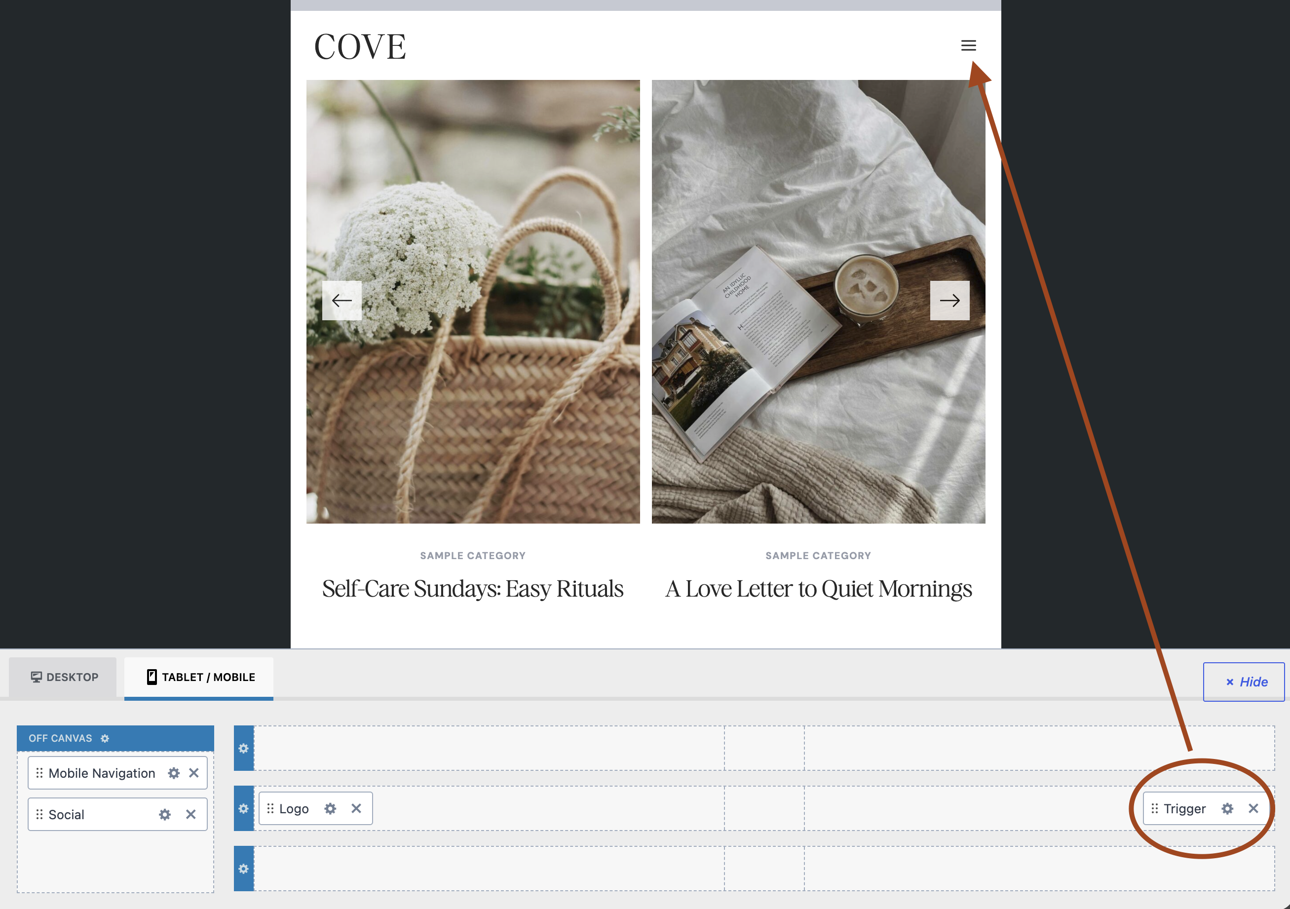
Tigger icon -
And whatever you place inside the Off Canvas area is what shows up inside that pop-out panel when the Trigger is clicked — usually your Mobile Navigation, but you can also add things like social icons, a search bar, or a button in there too.
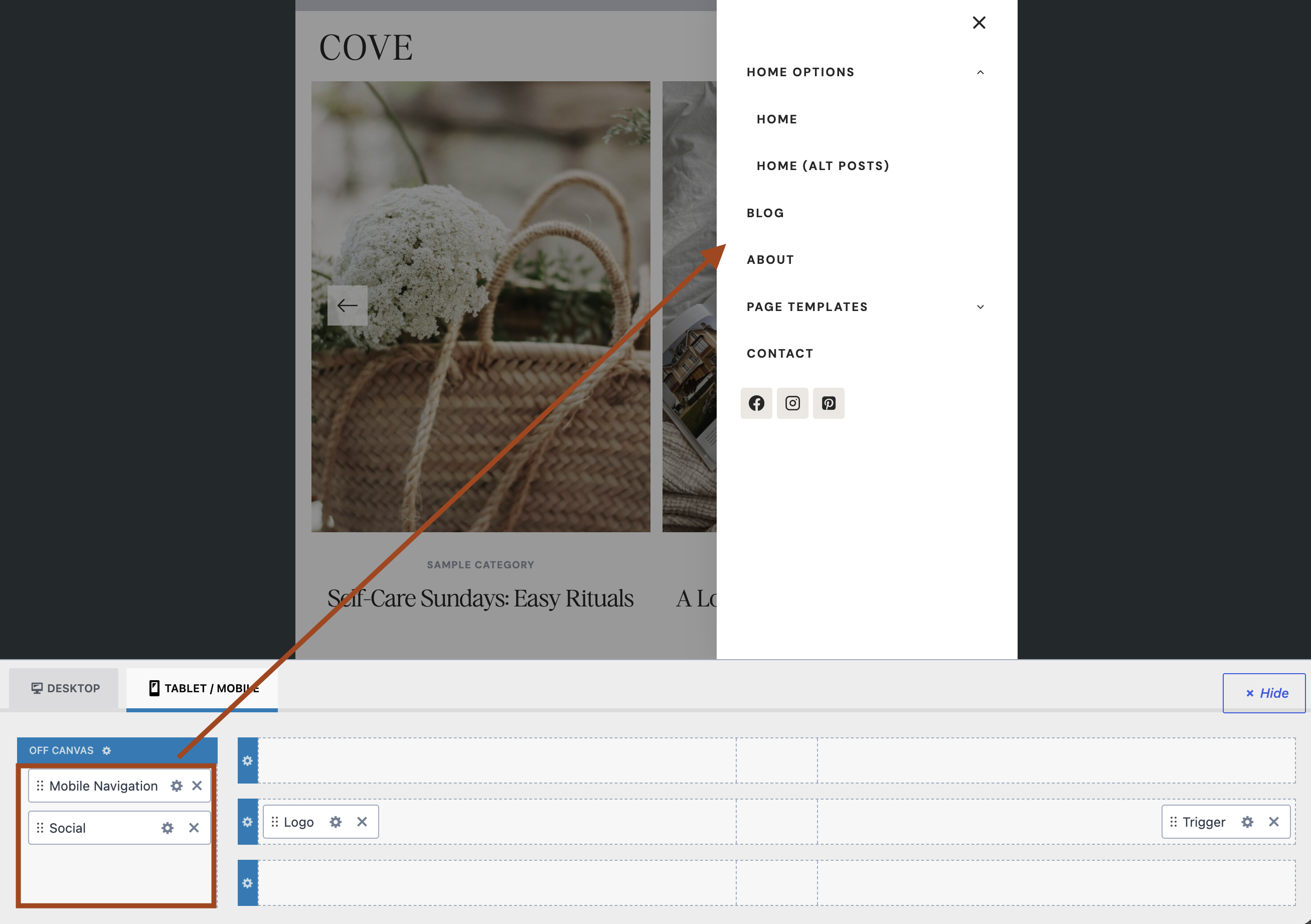
Off canvas items displaying in the pop-out panel
So, in short: the Trigger is the button that opens the menu, and the Off Canvas area is what's inside the menu itself.
How to add items to the Off Canvas Area?
Simply hover over the Off Canvas area and click the + sign to add any items you'd like.
How to Customize the Off Canvas Area?
Click the Off Canvas settings (gear) icon. This will open the settings on the left:

Sticky & Transparent Headers
Two more header styles worth knowing about, both found in their own sections under Customize > Header:
- Sticky Header — keeps your header visible at the top of the screen as visitors scroll down the page, instead of scrolling out of view. Learn More →
- Transparent Header — makes your header background see-through when the page first loads (great for hero sections with a full-width image), until the visitor scrolls and it switches to its normal, solid style. Learn More →
Both come with their own separate design settings so you can style how your header looks in each state.