
Kadence – Customizing Font Styles
The Typography settings let you control the fonts, sizes, colors, and spacing used across your entire site, from your body text to your headings. This guide will walk you through where to find those settings and what everything does!
💡 Kadence also includes built-in support for Google Fonts, so if you're using a Google Font plugin, I recommend removing it to prevent any conflicts.
Where to find your font settings
- From your dashboard, go to Appearance > Customize
- Click Colors & Fonts
- Click Typography
Here you'll see a list of text elements you can style, starting with your Base Font, followed by Headings, H1 through H6.

The Base Font
The Base Font controls the default body text, like your paragraphs and other general text.
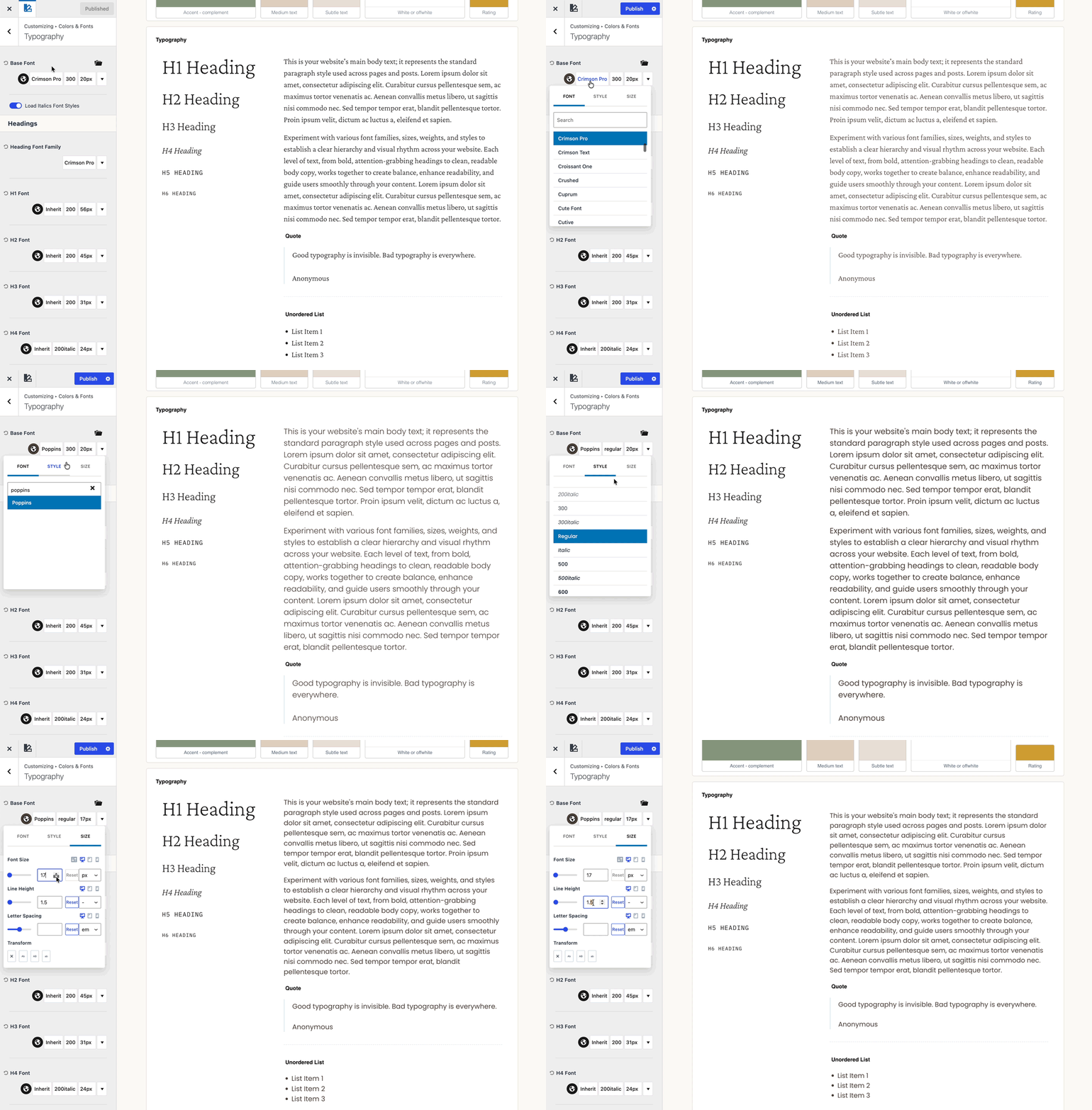
Click into the Base Font settings and you'll be able to adjust:
- Font Color — click the circle to use the color picker
- Font Family — click the current font name to open the font library, where you'll find over 1k Google Fonts to choose from (if you have custom fonts or want to use default system fonts, you'll find them at the very top of the list)
- Font Weight & Style — how bold or thin the font looks, or if it's normal or italic
- Font Size, Line Height & Letter Spacing — click the font size (or the little "style" tab) to adjust the font size, the line height (space between 2 lines of text) and the letter spacing (space between each character).
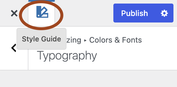
Click the Style Guide icon in the top left to preview your fonts as you make changes, like the gif above:
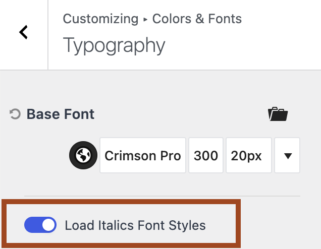
💡 Directly underneath the Base Font settings, you'll also see an option to load the italic style of your font. Enable this for the "true" italic version – just know it loads an extra font file, so you may want to skip it if you're already using a few fonts. Without it, italics will still work, just using a slanted version of your regular font instead.
Headings (H1–H6)
Scroll down and you'll find a separate section for each heading level – H1, H2, H3, and so on. These control the titles and section headers throughout your site (think page titles, blog post titles, and section headings).
Each one has its own font, size, weight, and color settings, so you can build a clear visual hierarchy – bigger for your H1s, tapering down as you go.
You'll click into each heading to make adjustments the same way you did for your Base Font above — color, font family, weight & style, size, line height, and letter spacing!
💡 Under Heading Font Family, you can choose the default font for all your headings. If any heading level below it is set to "Inherit," that just means it's following this Heading Font Family by default, rather than having its own separate style. For example: say your Heading Font Family is set to Crimson Pro. If your H1 and H2 are both set to "Inherit", they'll use Crimson Pro. But if you set your H3 to Poppins instead, your H3 will use Poppins while H1 and H2 continue following Crimson Pro.

A couple things to know
- Load your fonts locally to improve site speed! Navigate to Appearance > Customize > General > Performance > enable "Load Google Fonts Locally"
- Try to stick to around 2–4 fonts max across your whole site (one for headings, one for body text, maybe one accent). More than that, and your site design will start to look unpolished, and it can also slow your site down since each font has to load separately.